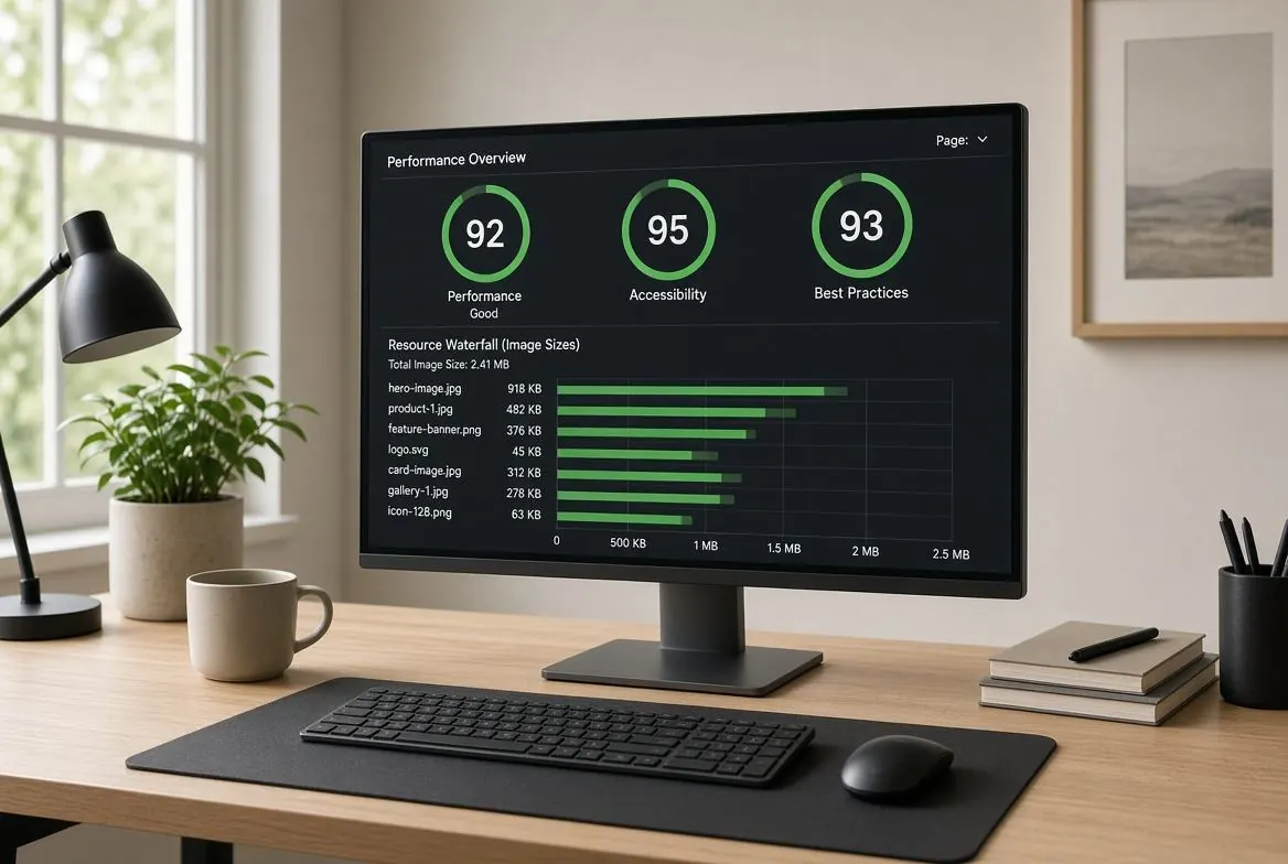
If you have ever run your website through Google PageSpeed Insights or Lighthouse, you have almost certainly seen the dreaded warning: "Properly size images." This single issue is often the biggest bottleneck preventing websites from achieving a 90+ performance score.
In 2026, Core Web Vitals (specifically Largest Contentful Paint, or LCP) are critical ranking factors for Google Search. Serving a 4000-pixel wide image inside a 400-pixel wide CSS container doesn't just waste bandwidth—it actively hurts your SEO. Here is a comprehensive guide to understanding, fixing, and automating the "properly size images" warning.
Why Does Google Flag This?
The "Properly size images" warning triggers when an image's natural (intrinsic) dimensions are significantly larger than the dimensions it is rendered at on the screen.
For example, if you upload a 10MB, 5000x3000 pixel photograph from your DSLR directly to your blog, and use CSS to display it at 800x480 pixels, you are forcing the user's browser to:
- Download all 10MB of data over their network.
- Hold the massive 5000x3000 image in device memory (RAM).
- Use the CPU to mathematically downscale the image to 800x480 pixels in real-time before painting it to the screen.
This drains mobile batteries, consumes data plans, and drastically increases page load times.
How to Fix It: Step-by-Step
Step 1: Identify the Rendered Dimensions
Before you can resize an image, you need to know how big it actually needs to be. You can find this using Chrome DevTools:
- Right-click the image on your website and select Inspect.
- In the Elements panel, hover your mouse over the
<img>tag. - A tooltip will appear showing the dimensions (e.g.,
800 x 450 px). It may also show the "Rendered size" vs. "Intrinsic size." - The Rendered size is your target width.
Step 2: Account for High-Density (Retina) Displays
If you resize the image to exactly the rendered size (e.g., 800px), it will look blurry on high-density screens like iPhones and MacBooks, which pack 2 to 3 physical pixels into every CSS pixel.
To fix the warning while maintaining sharpness, you should create multiple versions of the image, typically at 1x and 2x the rendered size.
- 1x Size (Standard displays): 800px wide.
- 2x Size (Retina displays): 1600px wide.
Step 3: Implement the srcset Attribute
You cannot simply replace the src attribute with the 2x image, because then Google will flag you for serving an oversized image to users on standard displays. The solution is the HTML srcset attribute, which lets the browser choose the correct file.
<img
    src="image-800w.jpg"
    srcset="image-800w.jpg 800w,
            image-1600w.jpg 1600w"
    sizes="(max-width: 800px) 100vw, 800px"
    alt="A properly sized image"
    loading="lazy"
>
How it works: The srcset tells the browser what files are available and their physical width (800w, 1600w). The sizes attribute tells the browser how wide the image will be displayed on the screen. The browser does the math and downloads the smallest file that will look sharp on the user's specific screen.
Optimizing for Largest Contentful Paint (LCP)
If the image triggering the warning is your "hero" image (the large image at the top of the page), it is likely your LCP element. Optimizing it requires special care:
- Do not lazy load it: Remove
loading="lazy"from your hero image. Lazy loading delays the image request until the browser has finished parsing the layout, which destroys your LCP score. - Add fetchpriority: Use
fetchpriority="high"on the hero image to tell the browser to download it immediately, before CSS or JS files. - Preload the exact size: If the hero image is injected via CSS backgrounds, use a
<link rel="preload">tag in your document head.
Automating the Process
Manually resizing images and writing srcset markup is tedious. If you are running a modern tech stack in 2026, you should automate this:
- Static Site Generators (Next.js, Gatsby, Astro): Use their built-in Image components (e.g.,
next/image). They automatically generate the responsive variants, inject thesrcset, and serve modern formats like WebP or AVIF. - WordPress: Ensure you are using a modern theme. WordPress automatically generates responsive sizes (thumbnail, medium, large) upon upload and outputs
srcsetnatively. If you still fail the audit, install an image optimization plugin like Smush or ShortPixel. - CDNs (Cloudflare, Cloudinary): Use edge-based image resizing. By appending query parameters to your image URL (e.g.,
/cdn-cgi/image/width=800/image.jpg), the CDN will resize the image on the fly and cache it at the edge.
The Results
Fixing the "Properly size images" warning is one of the highest-ROI technical SEO tasks you can perform. By implementing responsive images with srcset, you can reduce page weight by 50-80%, dramatically improve your mobile LCP scores, and provide a faster, smoother experience for your users.
