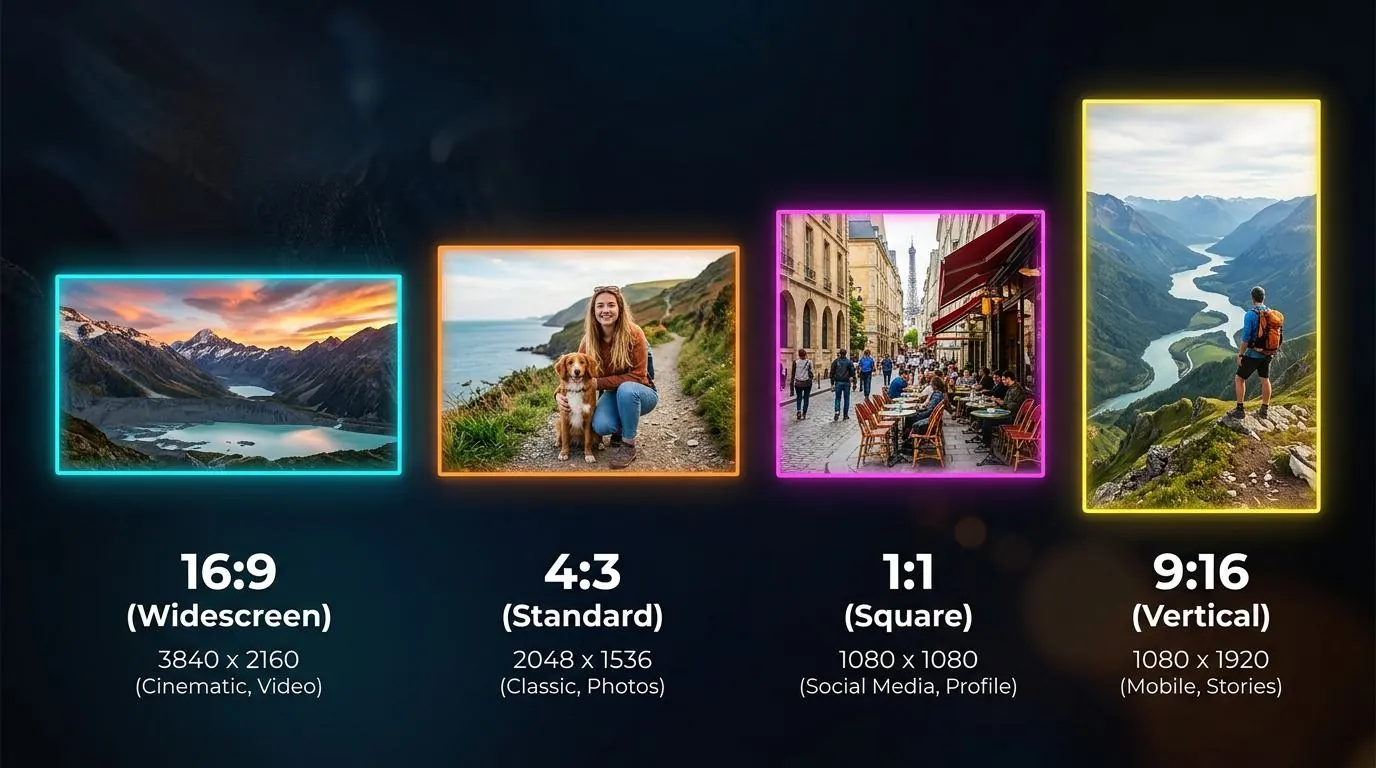
Aspect ratio is one of the most fundamental yet misunderstood concepts in digital imaging. An image's aspect ratio defines its shape—the proportional relationship between its width and height. Unlike exact pixel dimensions, the aspect ratio remains the same whether the image is thumbnail-sized or printed on a billboard.
Choosing the wrong aspect ratio for a specific medium leads to awkward black bars (letterboxing), vital content being chopped off, or horrific image stretching. In this comprehensive guide, we will break down the most common aspect ratios in 2026, when to use them, and the math behind resizing without distorting your subjects.
Understanding Aspect Ratio Notation
Aspect ratios are written as two numbers separated by a colon, such as 16:9 or 4:3. The first number represents the width, and the second represents the height.
A 1:1 aspect ratio means the image is perfectly square. A 2:1 aspect ratio means the image is exactly twice as wide as it is tall.
Sometimes, aspect ratios are expressed as a single decimal number (e.g., 1.77:1). This is found by dividing the width by the height (16 ÷ 9 = 1.77). This notation is especially common in cinema and videography.
The Most Common Aspect Ratios in 2026
1:1 (Square)
The square format is the undisputed king of e-commerce and social media profiles. Because it takes up an equal amount of horizontal and vertical space, it scales predictably on both mobile phones and widescreen desktop monitors.
- Common Uses: Instagram feed, Amazon product listings, Shopify catalogs, profile avatars.
- Typical Dimensions: 1080x1080px, 2000x2000px.
16:9 (Widescreen)
This is the standard for high-definition video (1080p, 4K, 8K) and most desktop monitors. If you are creating a YouTube thumbnail or a full-width background video for a website, 16:9 is the only choice.
- Common Uses: YouTube thumbnails, presentation slides (Keynote/PowerPoint), TV screens.
- Typical Dimensions: 1920x1080px, 1280x720px, 3840x2160px.
9:16 (Vertical Video)
The inverse of 16:9, this format completely dominates the mobile internet. Driven by TikTok, Instagram Reels, and YouTube Shorts, 9:16 is designed to fill a smartphone screen held vertically.
- Common Uses: TikTok, Instagram Stories/Reels, mobile-first advertising.
- Typical Dimensions: 1080x1920px.
4:3 (Standard Photography)
Historically the ratio of old CRT televisions, 4:3 is now primarily known as the native sensor ratio of most smartphones (including the iPhone and Samsung Galaxy series) and Micro Four-Thirds cameras. If you take a standard photo with your phone, it is likely 4:3.
- Common Uses: Uncropped smartphone photos, standard tablet displays (like the iPad).
- Typical Dimensions: 4032x3024px (12-megapixel smartphone photo).
3:2 (Classic 35mm Photography)
This is the native aspect ratio of 35mm film and most modern full-frame and APS-C digital cameras (DSLRs and mirrorless). It is slightly wider than 4:3.
- Common Uses: Professional photography, 4x6 print photos.
- Typical Dimensions: 6000x4000px (24-megapixel camera).
Resizing vs. Cropping
The most common mistake people make is trying to force an image into a new aspect ratio by changing its dimensions directly. If you take a 4:3 image and type in 16:9 dimensions, the image will stretch, making people look unnaturally wide and short.
How to Change Ratios Safely
If you have an image that is 3:2 and you need it to be 1:1, you have three options:
- Crop the Image: You must chop off the sides of the image to make it square. This results in data loss, so you must carefully position the crop box so you don't cut off important subjects.
- Letterboxing (Padding): You shrink the image so it fits entirely inside a square, and fill the remaining empty space (top and bottom) with solid color (usually white or black). This preserves the whole image but creates borders.
- Content-Aware Fill (AI): You pad the image like letterboxing, but use AI tools to invent new background pixels to fill the empty space. This is highly effective for skies and solid backgrounds but fails on complex scenes.
The Aspect Ratio Math
To determine the correct height for a desired width and aspect ratio, use this formula:
Height = (Width ÷ Aspect Ratio Width) × Aspect Ratio Height
Example: You need a 16:9 image that is 1200 pixels wide. What should the height be?
- 1200 ÷ 16 = 75
- 75 × 9 = 675
- Result: 1200 x 675 pixels.
Summary
Understanding aspect ratios prevents distorted visuals and amateurish presentations. By knowing the native ratio of your camera and the required ratio of your destination platform, you can plan your shots better, leaving enough negative space to crop safely later.
